Charity M. Jantzen,UXC

Humanitarian Evacuation
Life-saving passages (H.E.L.P.)
A Design for Social Good Case Study
By Charity M. Jantzen
“Refugees didn’t just escape a place. They had to escape a thousand memories until they’d put enough time and distance between them and their misery to wake to a better day.”— Nadia Hashimi
Humanitarian Evacuation
Life-saving passages (H.E.L.P.)
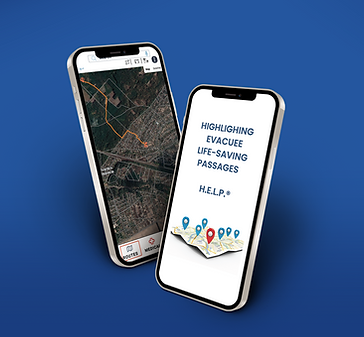
This app highlights safe passages for refugees during conflicts of war. It also has the ability to show civilians on the battlefield where they might find food, water, shelter and medical aide.

The Problem
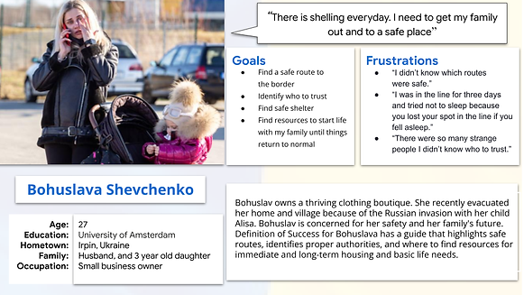
Refugees like Bohuslava Shevchenko who is a Ukrainian mother who needs to find safe passage to a neighboring country is unable to because Russia has been shelling her village nonstop, and she is scared for her family and her own life.
The Goal
Provide civilians in conflict a method to find a way to safety and much-needed resources.
My Role
All roles:
UX design and UX research from conceptualization to completion.
Responsibilities
-
Developing personas, user stories, and user journey maps
-
Conducting usability studies
-
Creating wireframes and prototypes
-
Testing and iterating on designs
-
Designing Mockups
-
High-fidelity prototype
-
Implementing accessibility
Understanding The User
Persona: Bohuslava Shevchenko
Bohuslava Shevchenko is a Ukraine refugee and a mother who needs To find safe passage to a neighboring country because Russia has been shelling her village nonstop, and she is scared for her life and her family's life.

Persona: Annamaria Molovska
Annamaria Moslovska is a Ukraine refugee child was sent ahead of her family. She feels alone and is confused about what is happening in her world. She needs a way to communicate and find her way to safety.

User Journey Map
Bohuslava’s journey map shows the importance of finding basic life needs such as food, water, hospitals, sanitation. While Annamaria journey shows that longs for companionship, fun, and their parents.
.png)

Ideation
After taking advanced steps to understand the users thinking and paths, I was able to noodle on a few designs before going digital.
I like to utilize the whiteboard and crazy 8 methods for to get the creative juices flowing.


Starting the Design
Digital wireframes
There is more to a map app than “hook it up to Google” you need to design for the interface around the app and the interactions the user will have with the map and any object within the map itself.

Low-fidelity prototype
The main focus of the low-fidelity prototype was to get usability feedback from actual users to perfect the design, which is why the prototype is very basic.
Link to my low-fidelity prototype.

Usability Study: Parameters

Study type
Moderated usability study

Location
Remote usability study

Participants
5 participants

Length
20-30 minutes
Usability Study: Findings
These were the main findings uncovered by the usability study:
.png)
Iconography
All the users found the water icon that was used to represent water sources confusing.
.png)
Navigation
Most of the user did not see their location on the map

Translation
The word “Counselor” does not translate to other languages.

Friction
Some of the participants did not know which shelter fit their needs.
Redefining The Design
Mockups
Before usability study

After usability study

Mockups
Based on the users' feedback, they could not find the virtual psychologist and wanted the ability to look for transportation and sanitation along the route.

Mockups
Based on the users' feedback, they could not find the virtual psychologist and wanted the ability to look for transportation and sanitation along the route.

Mockups
![iphone side by side [Converted].png](https://static.wixstatic.com/media/c49012_b5b5725f8f73470fb79c490ef5b5fe58~mv2.png/v1/fill/w_939,h_524,al_c,q_90,usm_0.66_1.00_0.01,enc_avif,quality_auto/iphone%20side%20by%20side%20%5BConverted%5D.png)
High-fidelity Prototype
View the Showboat Drive-in Theater

Accessibility Considerations
There was careful consideration regarding the typography to ensure readability.
I wanted to utilize a hierarchical page layout to keep things organized and assist screen readers in navigating what to do next.
Enhanced contrast, which meets AAA standards was used throughout the application.
Responsive Design
Site Map
Depicting the map for the system and the responsive sites helped me realize the entire breadth of the system.

Responsive Design
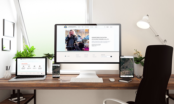
Because the refugees will not be navigating using websites, I wanted to make the responsive designs supportive of mission to raise funds and awareness for the projects goals.

Going Foward
Takeaways
Impact
This application has the ability to save lives, and help so many people. The impact alone in Ukraine would be priceless. If this app is available for the next conflict, which is unfortunately unavoidable, more refugees will have the opportunity to escape safely.
What I learned
I learned a lot working with actual refugees to build the personas, get feedback and now to actually start building this app. They are so strong and brave.
Next Steps
I will continue to design the rest of the app while conducting user research to improve the user needs for the app.
I will be adding more activities to the map feature such as pan, zoom, and search.
While improving the app, I will be working with developers and creatives from all over the world to build this application out and make it a reality.